I wanted to reimagine the Daybreaker+ home page as an exercise in Figma. The first few images show what the DAYBREAKER+ homepage currently looks like.
And here is what I felt the brand needed in order to give more energy to the homepage - more color, vibrancy, and friendlier fonts.
Here I used colors similar to those in the photo for cohesion.
I used the pre-established D.O.S.E. colors to create a rainbow that would shift slowly in the background.
A slightly more calm version, using just two of the D.O.S.E. colors. I removed the color blobs because they seemed too young and abstract, so I replaced them with elements from the Daybreaker logo.
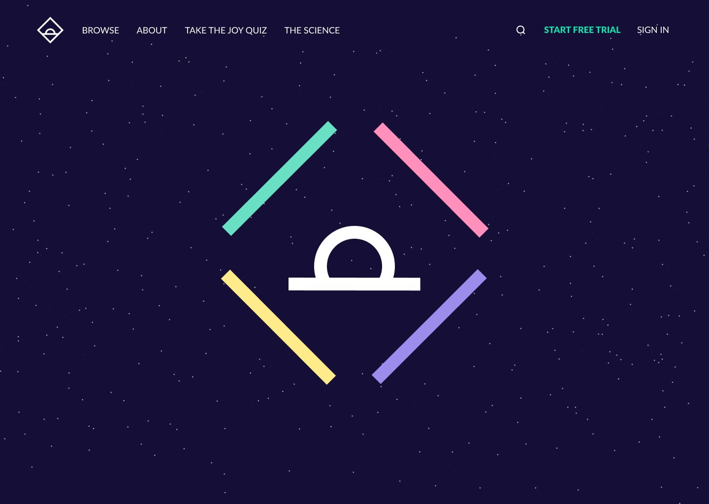
A different approach: this is how the screen begins.
As you scroll down, the logo begins to separate into five separate elements and the stars slowly fade away.
The four side elements turn into each color of D.O.S.E.
D.O.S.E. separates into the four corners, the sun rises, and the horizon dissipates.
The sun becomes the Call to Action button, text appears and information shows up in the pill shapes that have formed from the previous elements.
Call to action fades upwards as more info appears and each part of D.O.S.E. comes together.
The elements from each platform slide up one by one.
On hover, each arrow is highlighted in one of the main colors, and it moves outward (top arrow shift up, bottom arrow shifts down).
Ends with another Call to Action.


