Val Marie Brand Design
It all started when…
Valerie sought to create a distinctive brand for her YouTube channel, and I had the pleasure of guiding her through this creative journey. We began with a detailed phone conversation, during which she shared her vision and aspirations for the channel. To capture the essence of her hometown in the South of France, I curated an inspiration board that reflected the region's unique charm. Drawing from the vibrant colors of the local buildings and the serene beauty of the landscape, I selected a palette that would evoke a sense of place and nostalgia. Additionally, I presented Valerie with a range of fonts that embodied the key adjectives she provided, ensuring that each option resonated with her desired aesthetic. Together, we crafted a brand identity that beautifully encapsulates the spirit of the South of France and Valerie's personal connection to it.
COLORS
First, I created a mood board with images of the south of France, selecting individual colors from the images themselves.
Valerie wanted the colors to evoke a Provence Aesthetic, using lavender, sage green or olive green, yellow, blue, and light orange - bright pastels.
Then on a video call, we went through the colors together, and Valerie selected the group she liked the best, removing blue, and gave direction as to her specific shade preferences.
FONTS
I asked Valerie for a list of words that she wanted the logo to evoke:
Elegance
Craftsmanship
Aspirational
Feminine
South of France
She included a handful of extras, including: capable, inspirational, dreamy, tailor-made, useful, witty, authentic, autonomy, self reliance, strength, calming, soothing, nature, smart, satisfaction, quality, anti consumerism, sustainability.
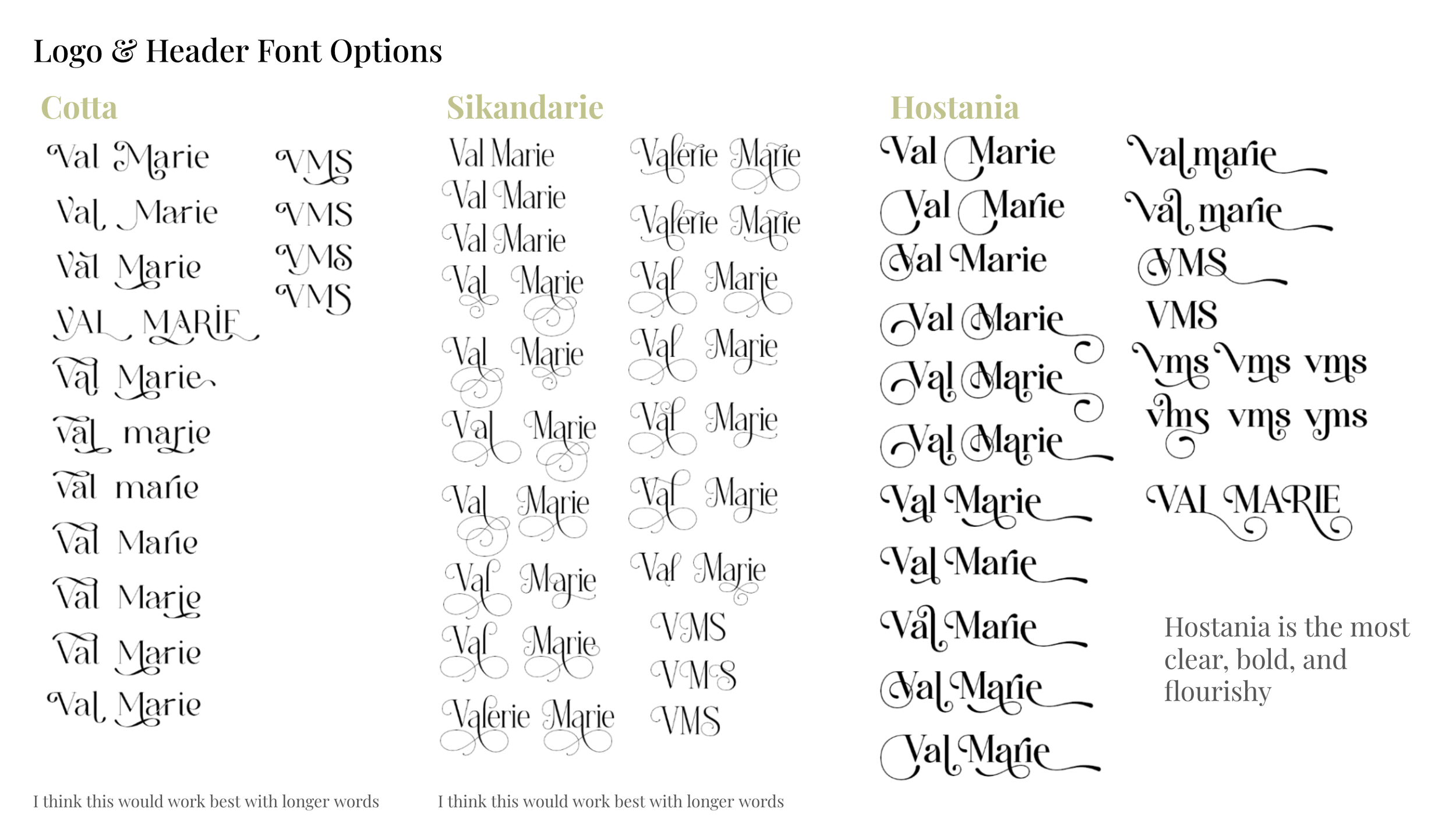
I picked 11 fonts that evoked these words, and she chose three from there. We purchased the fonts and I got to work, playing with all the glyph combinations.
LOGO
Valerie liked Sikandarie the best. I thought it was a bit too thin to use as a logo, so I added a stroke (gasp) and played around with the spacing. We determined with glyphs works best together in terms of proportions and balance, then I did a rough sketch of some classic bird embroidery scissors with two sprigs of lavender as the logo mark, and made it come to life!
Here’s how her Youtube page finally came out!
Here are some examples of how she used the font, logo mark, and logo type in her videos!
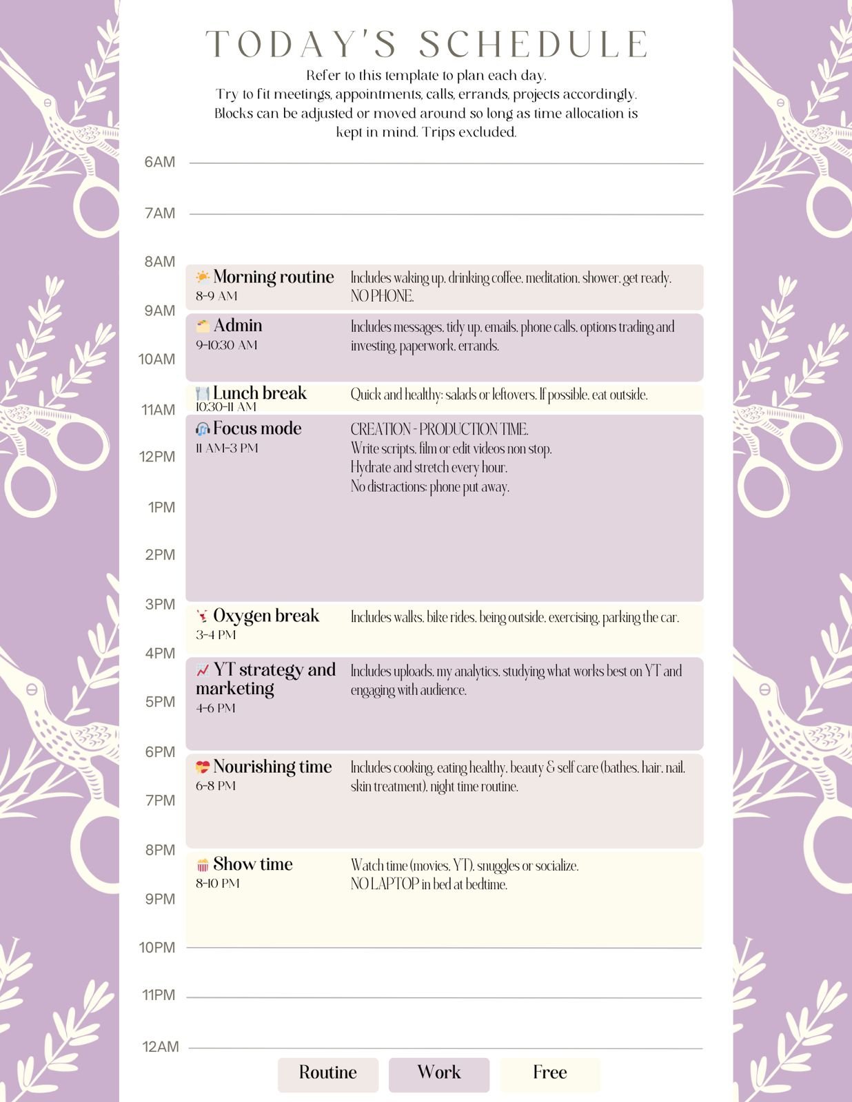
She even made a cute planner using the branding!


